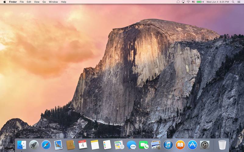
I wrote my thoughts about Monday’s WWDC elsewhere.1 Today I installed OS X Yosemite on a new partition in my 15″ MacBook Pro Retina (2.3 Ghz i7, 16GB RAM)2 and I only have one word: wow.

I’ll briefly elaborate on two of Yosemite’s aspects as of this beta 1.
Interface
It is gorgeous. Amazing. Beautiful. Helvetica Neue is a great fit. The new dock is lovely. Even the vivid blue of folders is ok.3 Transparency—although often buggy or ommited due to being beta 1—felt natural and appealing. Safari looks stunning. Other Apple apps which got a face-lift (like, Mail, Calendar, iMessages) are a perfect fit with the new semi-transparent window chrome. Using Mavericks now feels almost like what iOS 6 felt after using iOS 7.
Performance
Time for the bad stuff. Well, even for my computer Yosemite’s quite slow and it’s not only the UI. Definitely not a fit yet for a primary machine. But hold your pitchforks right there before start going mental against Cupertino: it’s only beta 1. Which, for Apple means something like early post-alpha for the rest of the world. Things will get better, faster; and I expect this to happen around beta 3 or 4.
All in all, OS X Yosemite—even now—is stunning.
And never forget what John Siracusa wrote on April 2, 2001:
I’ve said it before and I’ll say it again: the “X” is pronounced “ten”, like the roman number, not “ex” like the letter. Don’t make me come over there.
Update: I’ve deployed Yosemite in my late-2009 iMac and I’m happy to report it works smoothly. I’ve made it my primary boot partition. Exciting (and weird since on the Retina MacBook it lagged. I guess, post hoc, the choppy performance had to do with the retina UI.)
Update 2: Mac OS X Yosemite under the magnifying glass. A very nice round-up of all the visual changes in Yosemite.
Seven Twenty Three isn’t exactly ‘elsewhere’ per se; it’s a new blog I co-started with my friend Konstantinos. ↩
This is relevant to Yosemite’s performance; see Performance section. ↩
I bet, though, the exact color will change until the Fall release. ↩