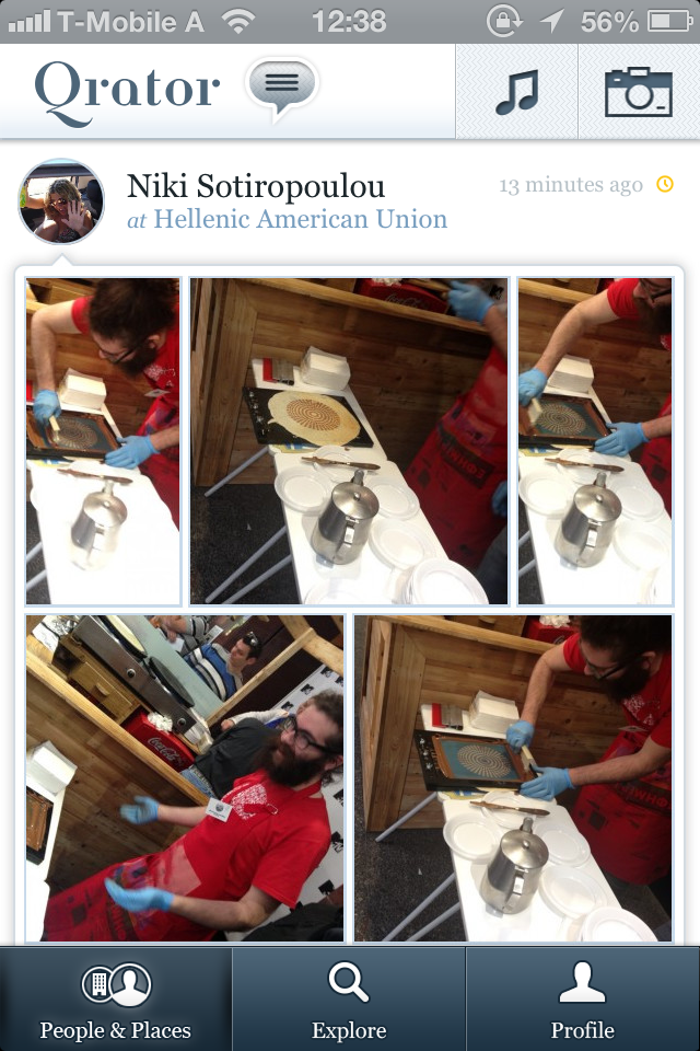
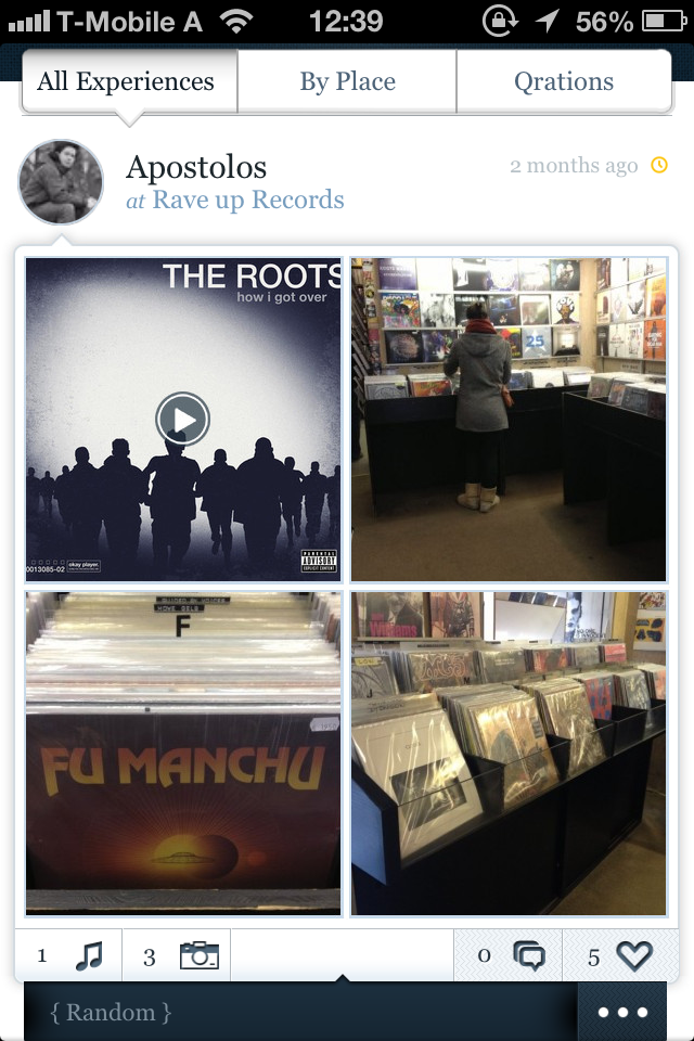
The social mobile market is quite a kerfuffle lately. Many apps try to do the same thing and carry out the same tasks without much (or, to put it better, useful) differentiation. For example, when I want to share a photo I have the following options:
- Path
- Flickr
- Google+, Tumblr, and more…
Options are good but after a point they can become overwhelming and crumbersome. Each service is a different medium, tells a different story, has different target group, content and privacy settings. On top of that, sometimes I have to manually re-upload a photo on another platform because there’s no API to bound them, these two services have different corporate strategy, are rivals, etc.
Enter Qrator.
Qrator is a new Greek startup recently out of private beta with the vision to change the landscape of social by focusing on storytelling. Qrator is available at the moment only for iOS, it’s free, and you can find it in the App Store.

Combining boards, music, photography and geolocation, Qrator stands where others haven’t and has a good chance to solve the aforementioned problems. I’ve been using it since its first private beta and it always felt a polished product.
Storytelling is a different and a non-conventional approach. By choosing where to share each individual story outside Qrator it’s easy to maintain consistency on different stories in different services—no need to mix things up. Automatic location detection (this is really cool) saves you time and adds an “Aha!” moment and a bit of foursquare API magic. Just like when you add a music track in your Qrator experience. An experience can hold as many photos as you want.

The best thing is that you can organize experiences in boards. So, a trip to New York can have its own board full of personal experiences from food to sightseeing, locations, soundtracks and more. A great way to take a walk down the memory lane.
What I’d like to see in future versions
Qrator is still in its early stage with solid foundations but I firmly believe there’s still room for improvements; especially in the UI front.
For starters, I’d love to see a bigger font size and action buttons (comment, like, “More”). I don’t know if it’s feasible, since Qrator has already a strong brand and a signature UI, but these two changes would make a big difference in the user interaction and experience. (Not to forget: double tap like.)
Also: scrolling. Focusing on content by removing superfluous UI elements is a great way to showcase it, but this back-and-forth of the re-appearing top and bottom bars when I’m changing my scrolling direction makes me dizzy. I don’t remember which app introduced this scrolling paradigm some time last year, but, personally, I think it breaks the experience.
Altogether, I can only recommend Qrator. It’s a new approach to digital storytelling and sharing with lots of potential. Get it here for free and try it out.