So, I’ve been cruising with my MacBook Air since February last year—wow, now that I think of it, it’s almost a year with the Air—but it’s only a couple days ago when I discovered a really great tweak for to maximize your desktop’s real-estate.
Normally every Mac computer has the dock by default in the bottom of the screen. That consumes a lot of desktop real-estate, especially if you own a 13″ or 15″ MacBook and use the dock with big icons or with magnification enabled. That being said, I made up my mind to think for other possible dock positions.
After spending some time tinkering this dock problem I came up with a descent solution. Change the dock’s position from bottom to left and enable the hiding option. I’m telling you, if you use a 13″ or 15″ MacBook series computer this little tweak will save you lots of space if you’re working with maximized or normal-sized windows.
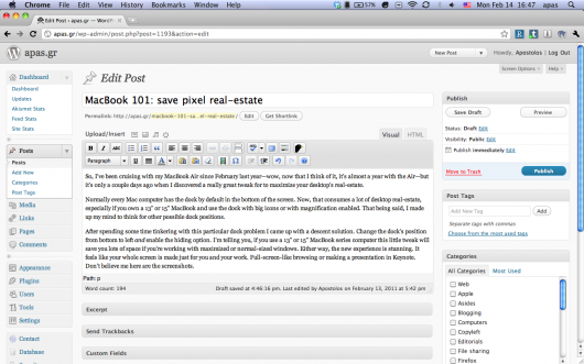
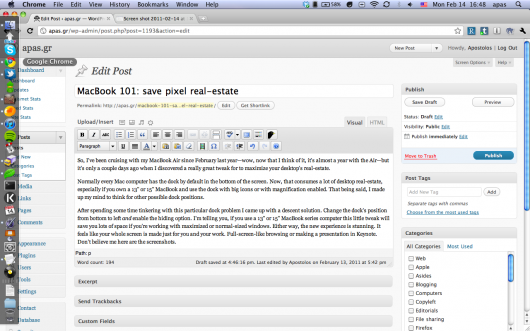
Either way, the new experience is stunning. It feels like your whole screen is made just for you and your work. Full-screen-like browsing or making a presentation in Keynote. Don’t believe me? Here are the screenshots (click for awesome Lightbox previews):
This is how I’m working from now on. As I said, it feels like a giant-full screen just for you and your work.
And this appears when I’m hovering my mouse on the left side of the screen. Sweet, small dock.
See? It’s a lot better. I’d recommend you change your dock asap. Trust me.


I paired that technique with Alfredapp last month and I recommend it. Of course, having Alfred, I use the dock less like a launcher.
I see your point. Despite not using Alfred or Quicksilver, I’m using Spotlight as a launcher quite frequently I have to say. I’m very satisfied with Spotlight and as far I tested QS and Alf, they both were too complicated for me.