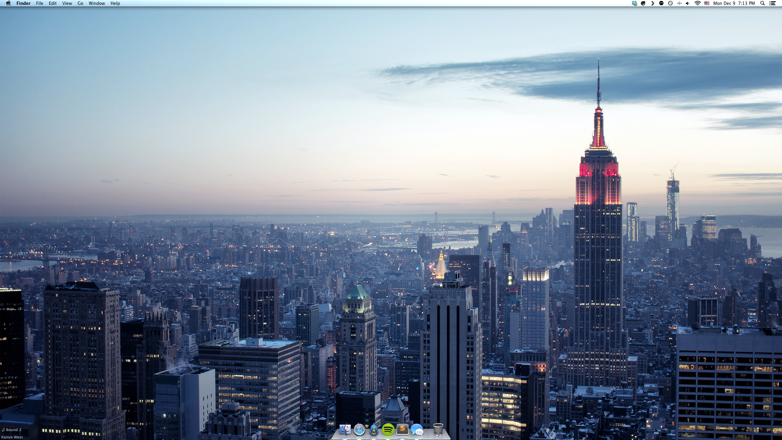
I was talking with my friend Zac the other day and he sent me a screenshot of his dock. What I found intriguing was the fact that his dock was completely free of clutter and didn’t look at all anything like your typical dock flotsam.
Since its inception Mac OS X was a minimalist OS — it introduced bona fide and groundbreaking UX and human-computer interaction paradigms (this continued later with iOS), kept only the absolute essential elements on the screen, and above all, helped the user do his job and be productive.
I used to keep a relatively sane dock as well but Zac’s system was clearly a lot better so I figured out I’d experiment more with this approach and will see if it works better than the other. (Spoiler: it does.)
Dock
First of all, I cleaned up my dock. Anything I don’t really use every day had to go. Now I have a dock of 5 apps in the iMac (6 in the Macbook; I use Sparrow there) excluding the Finder and Trash 1. This is how it looks like:

I use Spotlight as an application launcher. Somehow all the Alfred-like apps never got me interested since Spotlight just does the job and is fast enough. option + space to fire up Spotlight and then I type either one or two letters from the name of the app I want to open. Xc for Xcode, P for Plex, Ph for Photoshop and so on and so forth.
Finder
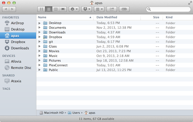
I rarely search for folders or files through Spotlight — I have my file system organized quite well and am really fast on navigating the Finder with keyboard shortcuts and without using the mouse at all. I’ve also built a custom keyboard shortcut script so I can access my Dropbox folder instantly.
A typical Finder access looks like this: click on Finder icon on the dock, open up Dropbox instantly through cmd + shift + v or type Doc, Dow or gi to navigate the pointer to my Documents, Downloads or git folder respectively (or any other folder I might need to), cmd + o to open the folder; then it’s the same letter-typing and cmd + o process as mentioned until I find the specific file.
Visual Clutter
For instance, desktop icons. I prefer no desktop icons at all. That’s what Windows are for, not a Macintosh. Something which is also quite useful is to check on your notifications and eliminate the ones you don’t need like in iOS.
There’s also visual clutter inside apps you use. In this case the axiom I go by is “remove everything that doesn’t have to be there.” In Safari, for example, this means no bookmarks bar (easily accessible via cmd + shift + b) and no tab bar (it shows up automatically anyway when open tabs > 1). 2

Similarly Finder’s sidebar is also stripped off of every non-essential option. I only left AirDrop, Desktop, my home folder, Dropbox, and Downloads shortcuts.
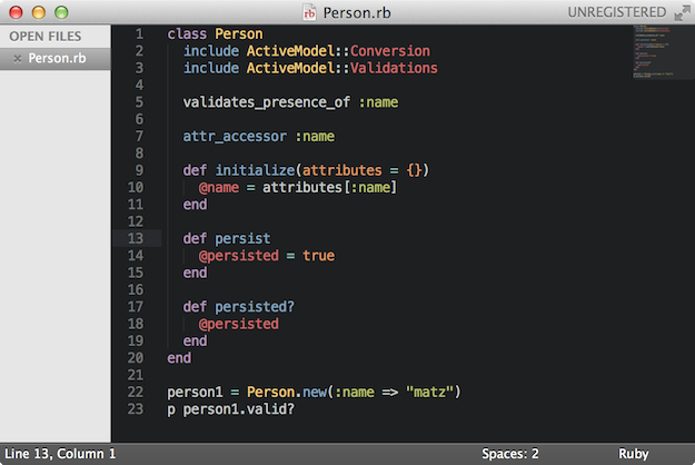
Apps like Sublime Text
In other 3rd-party apps it really is up to you and the app itself on how minimal you’ll go — what to remove and what to leave as is. Sometimes, some things are useful however they look like.
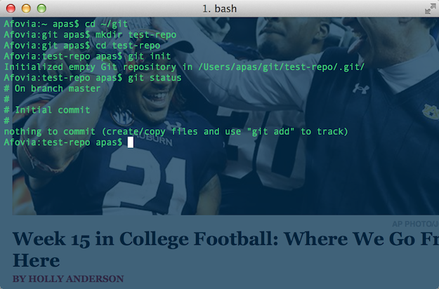
Other apps, like Sublime Text and iTerm, because of their customizable nature are meant to be adjusted into a more minimalist look and feel. Personally, I hide the tabs in Sublime Text (they take up uneccessary screen estate and are ugly) and keep a bare bones installation with a custom theme and some useful packages. 3 In iTerm, I’ve made it semi-transparent to ease the multitasking.
Menu Bar
I try to keep the menu bar in order, too. There are so many apps that try to own some screen estate by claiming a spot in the menu bar in order to ‘notify’ you of something or provide easy access to a certain option. I keep apps in the menu bar only if I can’t remove them from there. For example Bowtie which sits in the lower left corner of the screen normally uses a menu bar icon.

Not on my watch. Or Growl (which I still use for a few apps which don’t support Notification Center integration yet).
![]()
My menu bar consists of Dropbox, Droplr, Plex, LogMeIn, F.lux, and system icons. Surprisingly, I’ve never used Bartender either.
(Click for full-size desktop screenshot.)
Overall so far the system not only looks better but also operates a bit faster. I think I’m more productive since visual distractions either by apps on the dock or in-app clutter are eliminated. Visual stimuli are less, hence brain RAM is freed up. I can only recommend going minimal in OS X.
- Funny note: I have an OCD with the Trash. I always empty it — even with one file inside. ↩
- Regarding Safari extensions I suggest using 1Password (never type a password again; way safer!) and Evernote. I also use the Instapaper one and iCloud for tab sharing. ↩
- I’ll write a post about Sublime Text soon. ↩
