Instagram rolled out the other day its latest version — the best yet. New features include Photo Map (view your photos on a map,) redesigned profile and upload screens, infinite scrolling and more.
The app is faster than ever, extremely polished, the experience is excellent and the overall feeling is simply great. But — there is always a but.
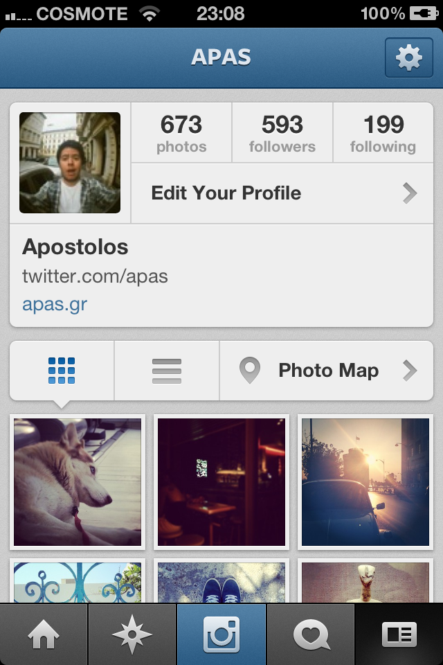
I don’t like the new profile redesign. Actually, I’d say I’m more concerned about it on a UX and IA (Information Architecture) level. Photographs (aka instagrams) lost their focus. They’re crammed down almost to a third of the screen in contrast to earlier versions.
Profile picture, photos, followers and following #, profile edit, name, bio and link take way too much screen and white real-estate. (Remember Google+ on big monitors?)
Now, I don’t know what this could mean — I don’t think Instagram wants to “unfocus” its photographs or this was a move out of pure necessity (which I don’t think so). But it’s a bummer every time I click on a profile. My primary focus is on the user’s latest photography. It simply doesn’t work here.

Yes I hate the new update and design they need to change it back.
Too much squared information, you get to the point.
I also don’t find the 3-column grid that useful, I’d prefer the previous design.
I don’t think it’s about “squared.”
The new design is just plain ugly. You can tell Facebook owns the app now. They’ve made it as ugly as their own site.
I hate the ((new update )) to is their anyway we can change it cause the old version was fine the way it was and about the new one I updated instagram yesterday and I don’t like that, Y’all need to unupdate instagram I looked up everything to figure out how to unupdate it and it didn’t help