In it’s latest blog post, Flickr announced it’s new photo experience for our photos aka photo page redesign. This is great news for photography geeks around the world, and not only.
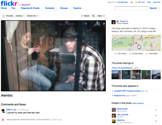
So, this is the new design.
Some quick facts
They’ll be rolling out the fresh features to the entire Flickr audience in the coming weeks but there’s also a beta opt-in (just visit a photo page and follow the 1-click-instructions atop). Photos will now be displayed with a larger 640 pixel wide size — plus the photo page will be a bit wider.
The photo owner, dates taken, camera, and location (with a great Yahoo! Maps implementation) of the photo are all within easy reach to the top-right of the image. They’ve reorganized all of the helpful features that we already know into a handy Actions menu.
There’s also a brand new light box view to spotlight your photos (no need now for 3rd party sites). Favorites integration into the photo’s comments. Finally, improved navigation controls and performance on the photo page (yes, it is faster).
And some thoughts
I’d prefer the old-school buttons above the photo and not the new reorganized shiny bling bling thingie. These buttons were something like a trademark for Flickr, don’t you think? I don’t like the idea that all actions will be packed under a drop-down menu with more submenus and clicks. The photo page has become wider — so, why change the famous buttons?
The new “sidebar-like” structure with the photo owner, dates taken, camera, and location of the photo, all within reach to the right of the image is great. I mean, I like it a lot. There seems to be a bug, though. My photos were taken using an iPhone 3GS and not 3G.
The light box vew is ultra fast. Like, ultra fast multiplied by fast. The next/previous works absolutely great and the one-click enable/disable is quite of a cool concept.
Obviously, last but not least, the new width of the photos is very handy. More detail, more pixel love combined with Flickr photo quality equals more fun using the website.
Summing up
- Things I did like: new sidebar structure & layout, lightbox feature, larger photo width
- Things I didn’t like: new “Actions” menu, 3G/3GS bug, favorites-in-comments appearance
Did you opt-in for the beta? Do you like the new Flickr redesign or care to share some thoughts? Feel free to comment.
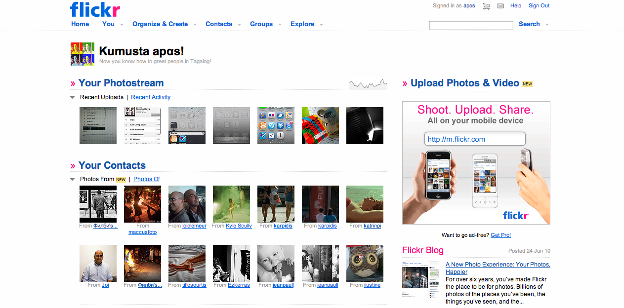
Update: Also the home page is redesigned (click for original size)
if it wasn’t for your post I wouldn’t have noticed the change. I really like the redesign, it’s cleaner and more structured.
the bug you mention is not flickr’s. flickr just reads the info from the photo. you can wipe it out or you can change it. either case, it’s an iPhone’s bug.
Yeah, the thing is that sometimes it’s 3GS and some others is 3G. Anyway, the new design is in general very good, kinda agree on that.